This post goes with the TED talk posted below. These are two graphics that I made from the site "gapminder".
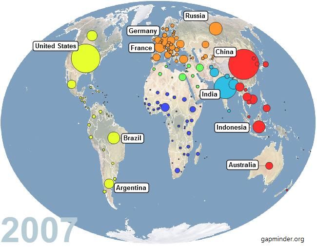
gapminder chart (f/u TED talk below)
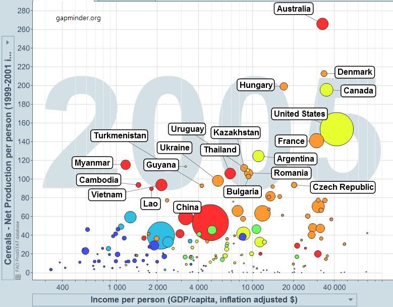
This graph shows the net production of cereals per person (on the y-axis). The size of the bubbles represents the total cereal production in the country. Australia has highest production per capita, but as a total, China produces most, followed by the US.
source: gapminder.org
gapminder chart (f/u TED talk below)
This graph shows the net production of cereals per person (on the y-axis). The size of the bubbles represents the total cereal production in the country. Australia has highest production per capita, but as a total, China produces most, followed by the US.
source: gapminder.org