Patrick Canning has an updated USDA report out concerning the divvying up of food dollar's spent here in the U.S. The report was categorized into three sections, a bit differently than in past reports.
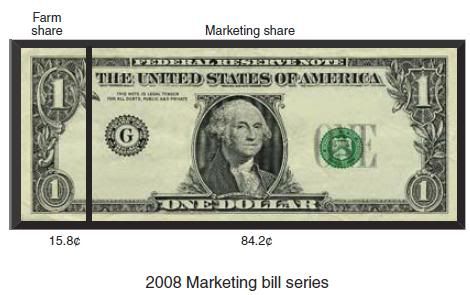
The farmer was on the receiving end of 16% of the money spent on food in 2008 in the U.S.
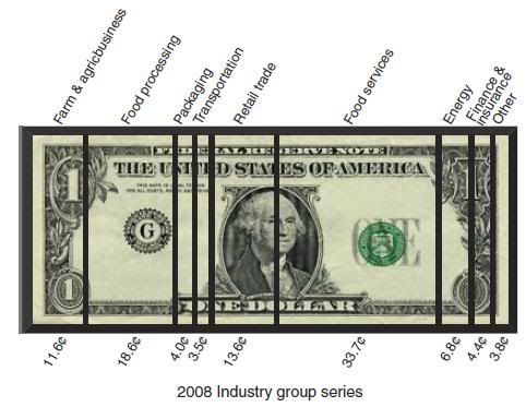
When the dollar is subdivided into ten major food industries, food processing accounts for 19%, food service 34%, and farm/agribusiness 12%.___________________________
The marketing bill series identifies the distribution of the food dollar between farm and marketing shares:
___________________________
The industry group series identifies the distribution of the food dollar among 10 distinct food supply chain industry groups:
___________________________
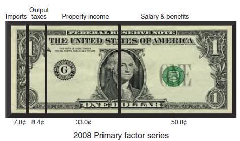
The primary factor series identifies the distribution of the food dollar in terms of U.S. worker salaries and benefits, rents to food industry property owners, taxes, and imports:
___________________________
To follow are some interesting statistics from the report:
___________________________
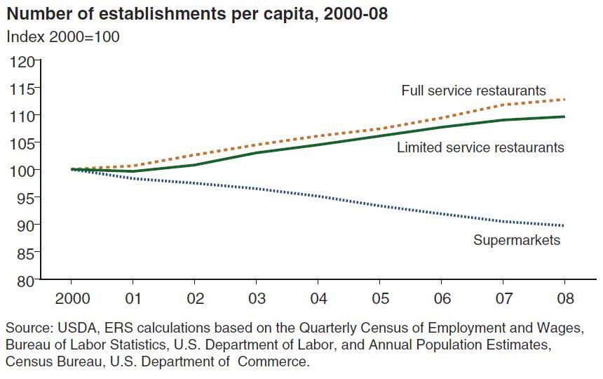
The report contains an interesting graph showing how market share of eating out has been growing while the number of supermarkets has been in decline.
___________________________
Finally, I thought I would add this chart by the BLS which shows where the food dollars come from, that is how much do Americans spend on food as related to their income level?

As I said yesterday regarding my news item, Beyond Food Miles, which referenced the 2010 USDA food energy use report, also by Patrick Canning, this food dollar spending report represents slack in our American food system, for those who worry. Both reports, one which focuses upon energy expenditures, and this which focuses upon dollar expenditures, indicate that processing, packaging, selling, and preparation consume a majority of these two budgets.
Much of this "slack" also represents our modern day unhealthy eating.
K. McDonald
References:
ERS Report Summary
Full Report: [PDF]
The farmer was on the receiving end of 16% of the money spent on food in 2008 in the U.S.
When the dollar is subdivided into ten major food industries, food processing accounts for 19%, food service 34%, and farm/agribusiness 12%.
The marketing bill series identifies the distribution of the food dollar between farm and marketing shares:

The industry group series identifies the distribution of the food dollar among 10 distinct food supply chain industry groups:

The primary factor series identifies the distribution of the food dollar in terms of U.S. worker salaries and benefits, rents to food industry property owners, taxes, and imports:

To follow are some interesting statistics from the report:
- This series indicates that the costs of marketing farm commodities to U.S. food consumers were an average of 4 cents higher per consumer food dollar than was previously reported between 1993 and 2006.
- In 2008, the farm share was almost 16 percent.
- In 2008, 4.2 cents of the 15.8-cent farm share was value added from nonfarm supply chain industry groups, such as energy, transportation, and financial services.
- Payments from each food dollar going to the energy industry group approached 7 cents in 2008, an increase of 75 percent since 1998.
- U.S. worker salaries and benefits coming from each food dollar steadily declined from 55 cents to 51 cents between 2001 and 2008.
- Imported ingredients, both food and nonfood, accounted for a growing share of the food dollar, climbing from less than 5 cents in 1993 to nearly 8 cents in 2008.
- In the food-at-home marketing bill series, the farm share of the food dollar remained around 24 cents from 1993 to 2008, suggesting that increasing expenditures on food services are behind much of the reduction in the farm share in the total marketing bill series.
The report contains an interesting graph showing how market share of eating out has been growing while the number of supermarkets has been in decline.

Finally, I thought I would add this chart by the BLS which shows where the food dollars come from, that is how much do Americans spend on food as related to their income level?

As I said yesterday regarding my news item, Beyond Food Miles, which referenced the 2010 USDA food energy use report, also by Patrick Canning, this food dollar spending report represents slack in our American food system, for those who worry. Both reports, one which focuses upon energy expenditures, and this which focuses upon dollar expenditures, indicate that processing, packaging, selling, and preparation consume a majority of these two budgets.
Much of this "slack" also represents our modern day unhealthy eating.
K. McDonald
References:
ERS Report Summary
Full Report: [PDF]